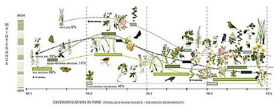
An interesting post from Treehugger points out the power of ‘maps’ as inventive ways to capture the complexity of ecological systems and provides education and support for ideas. An article mentioned (via core77) in Communication Arts entitled ‘Mapping Power’ references this idea in detail (and worth a careful read).

:: image via Treehugger
One example that the post mentions (seen above) is the systems mapping for the The High Line, a signature trademark of Field Operations: “The creative use of mapping that Friends of the High Line used to help turn existing infrastructure into a green oasis shows that making the goals of green efforts visual has as great an impact as the more negative images we’re used to seeing, such as showing the very disturbing impacts of climate change, or driving home numbers that are too big for people to really comprehend without an image.”
Additionally, from the article: “…the image artfully evokes the evolution of flora and fauna over the course of four years. The graphic is an example of the power of design to fire the imagination—and in the process cultivate political power and support. The Friends of the High Line have paid careful attention to their graphic materials from the start, using compelling visuals to project their vision vividly and ultimately to pry loose the millions of dollars of public and private financing necessary to make this fantastic idea happen.”

:: image via Communication Arts
This is pretty standard operation for designers, communicating massive amounts of information, and distilling it, via maps and evocative graphic renderings to sell projects. The complexity of information (ala Edward Tufte) using complex symbols and graphic design principles not often implemented in the past for landscape architecture graphics (which seemed stuck in a visual rut for a long time), but seen often in landscape urbanist proposals and competition entries… and has changed the way we communicate.
Another example mentioned, which is close to my heart is the Green Map (I did the original Portland version back from 1998-2002), brainchild of the fabulous Wendy Brawer, an icon-based system for education and empowerment. Via the CA article, a quote from Brawer: “This Map encourages people to explore and understand our city-helping expand our community of environmental stewards who understand the interconnections between the natural and built environments. It can help build a network of links among people of different ages and backgrounds by highlighting places that are important to our common future. It promotes and fosters replication of successful projects. Moreover, it challenges the assumption that this intensely urban setting has little redeeming ecological value.”

:: image via Communication Arts
The blurring of lines between traditional mapping, graphic design, symbology, and planning methods offers many new options for communicating of ideas that will be more useful as the availability of information and the complexity of design ideas expand. As John Emerson writes in the article: “There’s no doubt that visual media has the power to influence an audience, but visual media can also be used to visualize power itself. Visualizing power is a way of interpreting and understanding it. And this understanding can become a basis for challenging it. Design can be used to describe and locate power, to pressure those who hold power, and ultimately to facilitate and generate power by bringing people together. So why do so few designers take advantage of this persuasive power?”
Something for us all to ponder… plus they all look pretty cool as well – an artform in their own right.